How to make a change and keep it the same.
A difficult task, a Telegraph Hill label refresh that needs to remain recognisable for our current customer base and yet refreshed and new too.
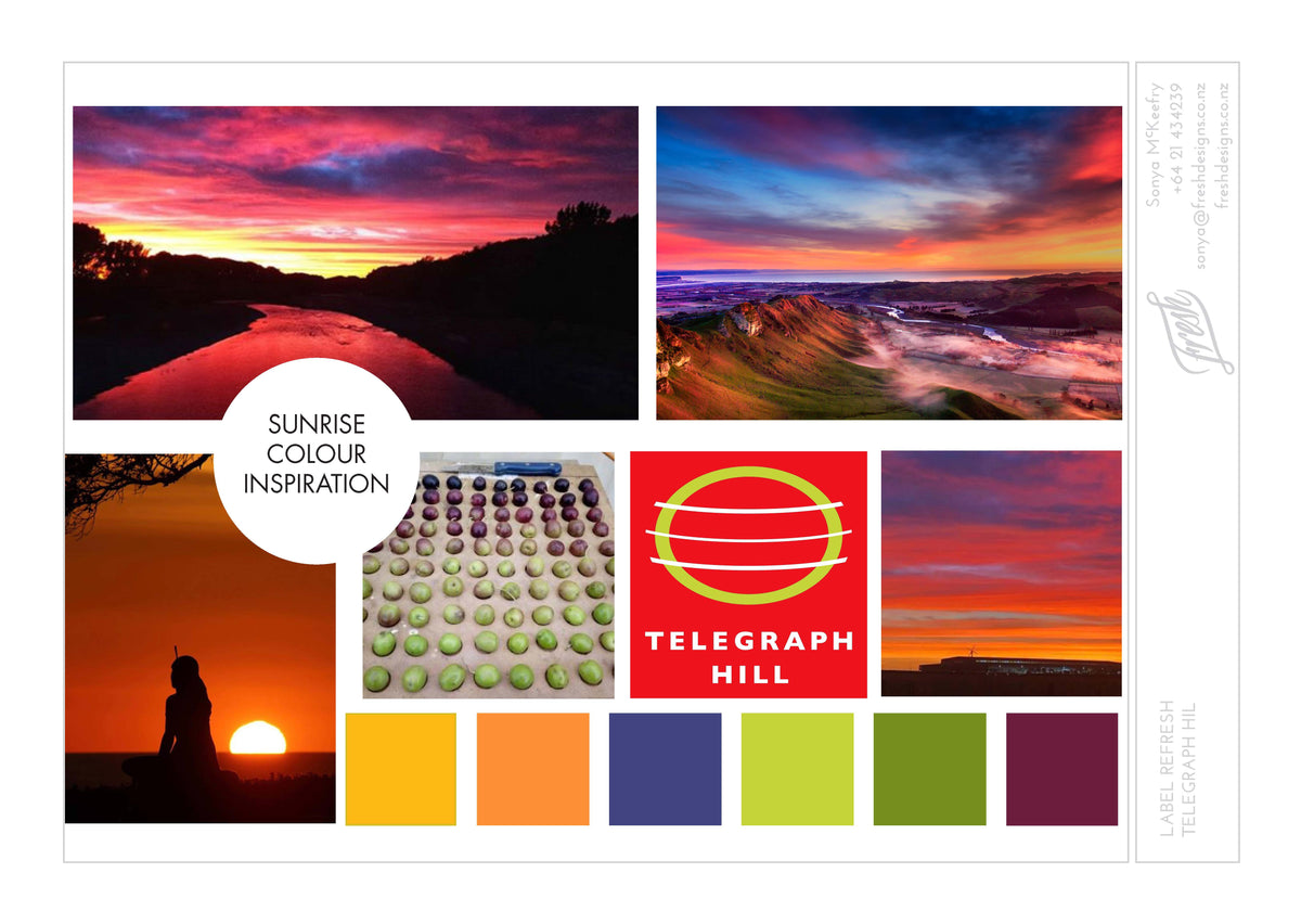
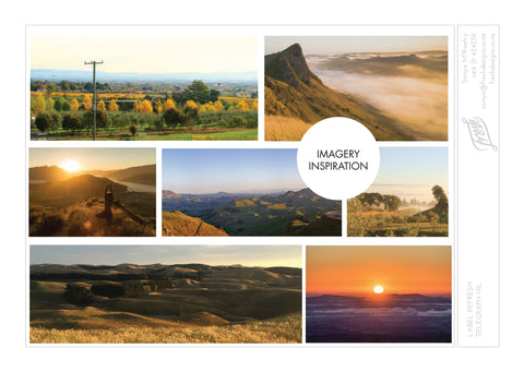
This was achieved by looking around us, at the landscape we grow our olives in, the place of our original olive grove on Te Mata hills, and recognising the inspiration for the business and original red colour of Telegraph Hill.

The beautiful reds of sunrise also show a glimpse of the other colours on show, which we have used across our range. Big ups to Sonya at Fresh Designs for her creativity.

The label symbolises new beginnings as well as the purity of the ingredients, the sunshine, warmth, how it inspires, energise and renews, much like our product when we infuse and blend, which occurs in making our products, full of depth and flavour.
"From the hills surrounding Hawke's bay (where our olives grow), to the colours of the sunrise and the flavourful foods that nourish and sustain our bodies, Telegraph Hill is my inspiration for making life better" says Geoff Crawford (Owner).
The new labels will be launched mid June, on our 6 new products.


